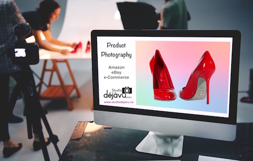
First impressions count when selling on Amazon or on your own website, and high quality images are the best way to give a first impression to your customers to click the buy button. With every moment that passes, online shopping becomes more image-driven, so as a small business owner you should learn how best to showcase your products on different marketplaces.
Pictures are an essential part of online shopping. Quality pictures help improve the overall customer experience, and assuming that a product is priced properly in the first place, the more time and effort a business puts into quality images, the higher their return on investment will be.
Online marketplaces such as Amazon, eBay or Etsy are giving product images a lot of attention these days. In fact, it’s a make or break deal. You either follow their image guidelines or you won’t be able to sell on their platforms – no exceptions. This is because they have seen a direct correlation between quality images, customer shopping experience, and conversion rate. Put simply, the better your product pictures, the more you will sell, and the more profit they will make.
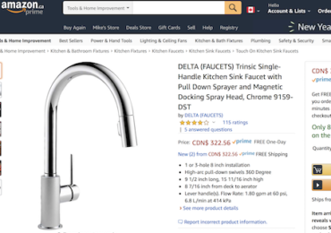
This trend is now reinforced by the image-focused search navigation that is being provided by Amazon, eBay, Etsy, and others. Shoppers now instinctively look at the product image first, and any additional information such a product description second, so more and more sellers include more and more of the product information on Infographic pictures.
Just consider these statistics regarding ecommerce after the rise of mobile commerce:
- Digital interactions influence 56% of every dollar spent in brick-and-mortar stores
- Amazon attracts most PC users and has 87% audience growth on mobile
- Nearly one third of page views are from mobile and tablet
- In 2018, eBay became one of the most popular mobile shopping apps in the United States with a 31.7 percent audience reach
- At least one third of all eBay transactions are ‘touched’ at some point on mobile devices, even if the eventual sale is made via the website.
- Smaller screens mean clean, minimalist design and a focus on the basics. And the basics increasingly mean image composition.
At the end of the day, if your images are below average, you will struggle to attract both the buyer’s attention and the sale. This is why it’s important to make sure you use high quality images that meet (and preferably exceed) the channel’s specified guidelines.
Using a white background has many advantages, from better display on mobile devices to smaller file size. It’s a format customers are used to and comfortable with on all channels and should be considered as a best practice. Acompletely white background (RGB 255-255-255) is required for all Amazon main images so that they blend in seamlessly with the search and item detail pages. While not a requirement for additional images on Amazon, and not a requirement on the other marketplaces mentioned here, it is nonetheless highly recommended by each of them. Make sure your product fills 85% or more of the image. Customers don’t like a tiny product floating in a sea of white space, especially when viewing on their mobile phone! Additionally, ensure that your images are at least 1500 pixels or more on the longest side to ensure that zoom and enlarge features are activated on most marketplaces.
Finally try to keep your pictures consistent between your products. Consistent images communicate strong brand identity, confidence, and professionalism, all of which make buyers feel more comfortable buying from you.

